来源:企业网站建设发布日期:2022-04-23 浏览次数:15
一、字体
用户机器中安装的字体。
保存在第三方网站上的字体。最常见的是Typekit 和Google,可以使用link 标签把它们链接到你的页面上。
保存在你的Web 服务器上的字体。这些字体可以使用@font-face 规则随网页一起发送给浏览器。
与字体样式相关的6 个属性。
  font-family
  font-size
  font-style
  font-weight
  font-variant
  font(简写属性)
有哪些通用的字体类呢?有以下5 种:
serif,也就是衬线字体,在每个字符笔画的末端会有一些装饰线;
sans-serif,也就是无衬线字体,字符笔画的末端没有装饰线;
monospace,也就是等宽字体,顾名思义,就是每个字符的宽度相等(也称代码体);
cursive,也就是草书体或手写体;
fantasy,不能归入其他类别的字体(一般都是奇形怪状的字体)。
二、文本属性
以下是几个最有用的CSS 文本属性:
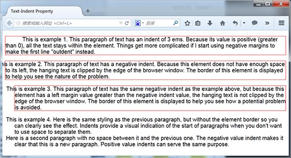
text-indent
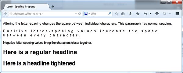
letter-spacing
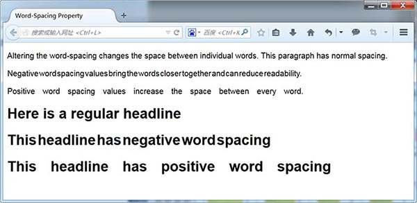
word-spacing
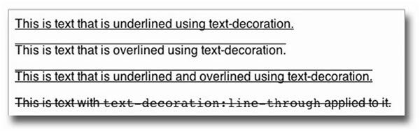
text-decoration
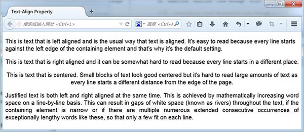
text-align
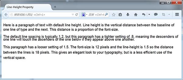
line-height
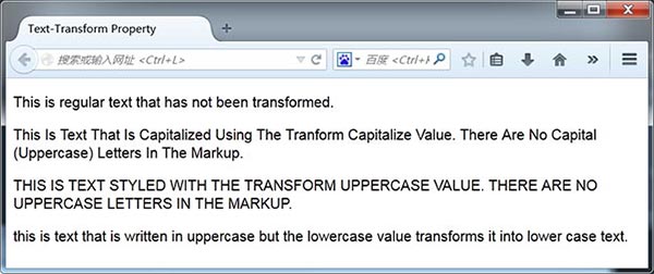
text-transform
vertical-align
text-indent:
letter-spacing:
word-spacing:
text-decoration:
text-align:
line-height:
text-transform:
vertical-align:
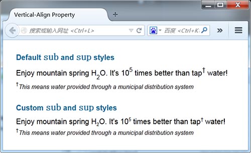
  1p.custom sub {font-size:60%; vertical-align:-.4em;}
  2p.custom sup {font-size:65%; vertical-align:.65em;}
  3p.customsmall {font-size:.8em; vertical-align:1em;}
三、Web字体
@font-face 规则为设计师提供了系统自带字体以外的广泛选择。换句话说,浏览器可以从Web 服务器下载字体,就意味着不必再依赖用户机器中的字体,而且也可以确保用户能够看到CSS 中设定的字体。
设定Web 字体的方式有以下三种。
使用Google Web Fonts 或Adobe 的Typekit 等公共字体库。
使用事先打好包的@font-face 包。
使用Font Squirrel 用你自己的字体生成@font-face 包。
1. 公共字体库
打开http://www.google.com/webfonts,找到想要的字体,单击Add to Collection 按钮,然后单击页面底部的Use 按钮。然后,Google 就会生成一个指向你刚刚选定字体的标签,直接把它复制粘贴到你的HTML 文件中即可。
<link href='http://fonts.googleapis.com/css?family=Anton|Niconne|Prata'rel='stylesheet'type='text/css'>
把这个链接添加到页面的标签中之后,就可以像使用其他字体一样使用这些Web 字体了。用户打开网页时,浏览器就会从Google 的服务器得到相应字体。比如
h3 {font: 20px "Prata", serif;}2. 打包的@font-face包
  @font-face {
  /*这就是将来在字体栈中引用的字体族的名字*/
  font-family:'UbuntuTitlingBold';
  src: url('UbuntuTitling-Bold-webfont.eot');
  src: url('UbuntuTitling-Bold-webfont.eot?#iefix')
  format('embedded-opentype'),
  url('UbuntuTitling-Bold-webfont.woff')
  format('woff'),
  url('UbuntuTitling-Bold-webfont.ttf')
  format('truetype'),
  url('UbuntuTitling-Bold-webfont.
  svg#UbuntuTitlingBold') format('svg');
  font-weight: normal;
  font-style: normal;
  }
把以上代码添加到网页中之后,就可以使用font-family 以常规方式引用该字体了。引用字体时要使用@font-face 规则中font-family 属性的值作为字体族的名字。
四、文字版式
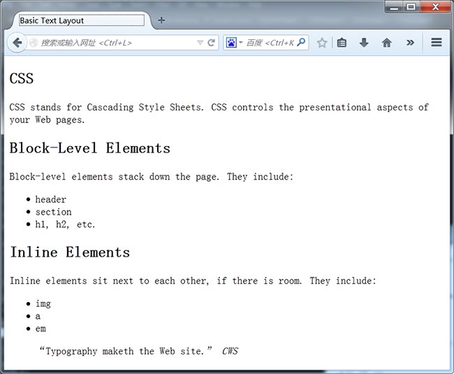
1. 简单的文本布局
<article>
 <h1>CSS</h1>
 <p>CSS stands for Cascading Style Sheets. CSS controls the presentational aspects of your Web pages.</p>
 <h2>Block-Level Elements</h2>
 <p>Block-level elements stack down the page. They include:</p>
 <ul>
  <li><code>header</code></li>
  <li><code>section</code></li>
  <li><code>h1, h2, etc.</code></li>
 </ul>
 <h2>Inline Elements</h2>
 <p>Inline elements sit next to each other, if there is room. They include:</p>
 <ul>
  <li><code>img</code></li>
  <li><code>a</code></li>
  <li><code>em</code></li>
 </ul>
 <blockquote>
  <q>Typography maketh the Web site.</q><cite>CWS</cite>
 </blockquote>
</article>
  1/*删除所有元素的外边距*/
  2* {margin:0; padding:0;}
  3/*设定主字体族和字体大小*/
  4body {font:1.0em helvetica, arial, sans-serif;}
  5/*居中显示盒子*/
  6article {width:500px; margin:20px auto; padding:20px; border:2px solid
#999;}
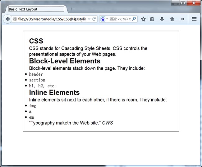
接下来,需要巧妙地安排一下元素间的垂直距离。另外,去掉默认外边距后列表项目的符号也跑到了外面,这里一块儿修复。
   /*标题周围的空白*/
  h1, h2, h3, h4, h5, h6 {line-height:1.15em; margin-bottom:.1em;}
  /*文本元素周围的空白*/
  p, ul, blockquote {line-height:1.15em; margin-bottom:.75em;}
  /*缩进列表*/
  ul {margin-left:32px;}
最后,让各级标题也更均衡一些,保证较大的标题突出,最小的标题也不至于不明显,同时也增大了code 元素的字体。
  /*调整标题文本*/
  h1 {font-size:1.9em;}
  h2 {font-size:1.6em;}
  h3 {font-size:1.4em;}
  5h4 {font-size:1.2em;}
  h5 {font-size:1em;}
  h6 {font-size:.9em;}
  /*调整段落文本*/
  p {font-size:.9em;}
  /*调整代码文本(默认值太小了)*/
  code {font-size:1.3em;}
2. 基于网格排版
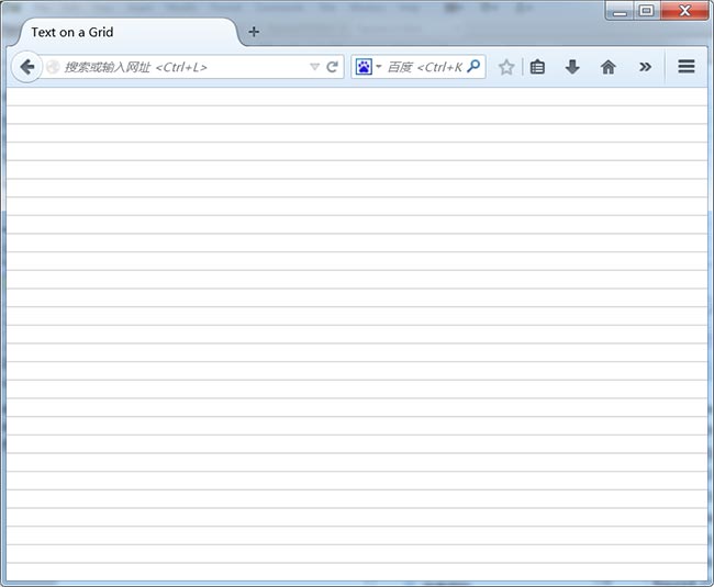
使用Adobe Fireworks创建了一个100×18 像素的矩形,并在它的底部画了一条灰线。然后将其保存为.png 格式,并命名为grid_18px.png
把这张图片放到body 元素的背景上:
  /*添加网格线*/
  body {background-image:url(images/grid_18px.png);}
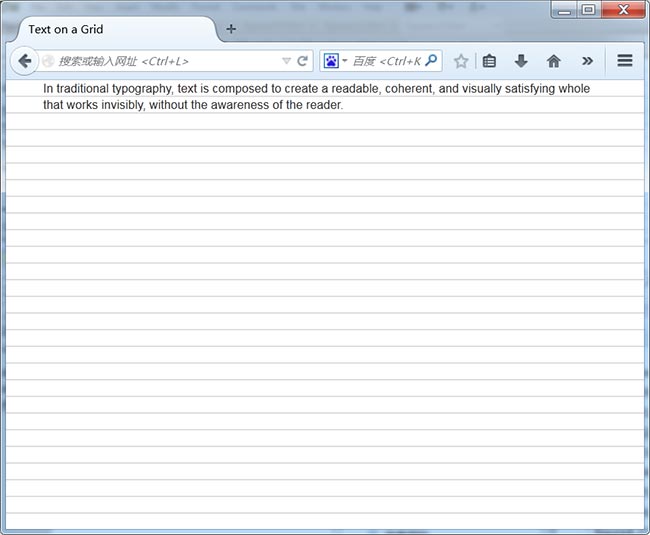
这个例子包含如下所示的简单段落:
  In traditional typography, text is composed…
  CSS 规则如下:
  /*去掉所有元素的内边距和外边距*/
  * {margin:0; padding:0;}
  body {
   /*添加网格背景*/
  background-image:url(images/grid_18px.png);
   /*设定字体*/
  font:100% helvetica, arial, sans-serif;
   /*加宽左右外边距,得到一栏的雏形*/
   margin:0 40px 0;
  }
  p {
   /*设定字体大小*/
   font-size:13px;
  /*将行高设定为等于网格高*/
   line-height:18px;
  }
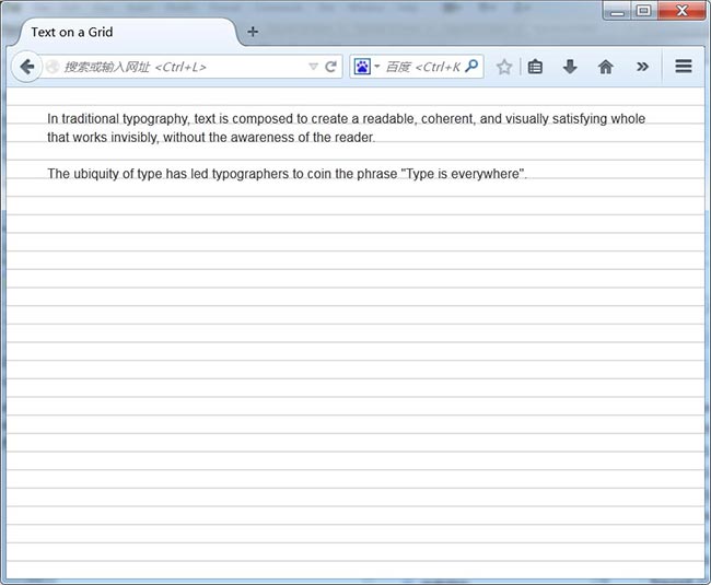
再给容器body 元素添加4 像素的内边距,以便把元素向下推到文本基线与网格对齐的位置。只要让第一个元素与网格对齐,其他元素就都能对齐了。实际上,给body上方添加了22 像素(4+18)的内边距,以便上方能有一定的空间:通过margin-bottom在每个段落之间加上一个空行:
  padding-top:22px;
  之后,给段落添加一条声明:
  p {
    /*设定字体大小*/
  font-size:13px;
  /*把行高设定为等于网格高度*/
  line-height:18px;
  margin-bottom:18px;
  }
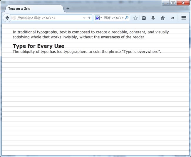
现在增加一个h3的标签:
In traditional typography, text is composed…
Type for Every Use
The ubiquity of type has led typographers…
针对这个标题的CSS 规则如下:
h3 {font-size:18px; line-height:18px;}
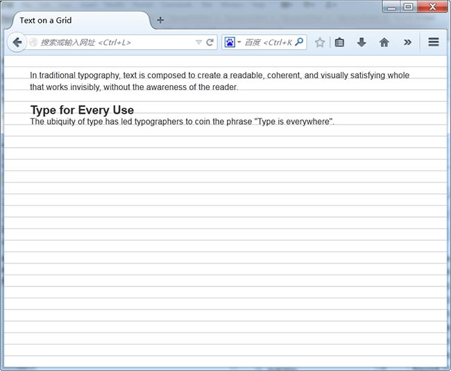
标题的基线比网格低几个像素,需要做一些调整:
  h3 {
   font-size:18px;
   line-height:18px;
  margin-top:-2px;
   margin-bottom:2px;
  }
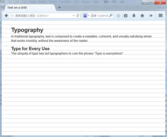
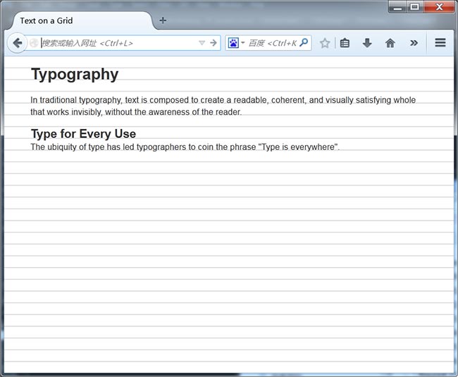
通过类似的技巧对齐比网格高的元素,比如h1 1
Typography
In traditional typography…
当前给它设定的CSS 如下:
h1 {font-size:24px; line-height:36px;}
  h1 {
  font-size:24px;
  line-height:36px;
  margin-top:-13px;
  margin-bottom:13px;
 }
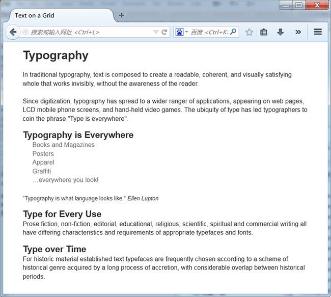
在这个练习最后,我们再加几个不同字体大小的标题、一个无序列表和一个blockquote 元素。看一看把网格去掉之后页面是什么样子。
  * {margin:0; padding:0;}
  body {font:100% helvetica, arial, sans-serif; backgroundimage:
  url(images/grid_18px.png); margin:0 20px 0; padding:21px;}
  p {font-size:14px; line-height:18px; margin-bottom:18px;}
  h1 {font-size:24px; line-height:36px; margin-top:-13px;
margin-bottom:13px;}
  h2 {font-size:18px; line-height:18px; margin-top:-2px;
margin-bottom:2px;}
  h3 {font-size:16px; line-height:18px; margin-top:-2px;
margin-bottom:2px;}
  ul {margin-bottom:18px;}
  li {font-size:13px; list-style-type:none; padding:0 20px;
line-height:18px;}
  a {color:#777; text-decoration:none;}
  blockquote {font-size:12px; line-height:18px; paddingtop: 2px;
margin-bottom:16px;}
 微信便捷交流